Current 2.3: How Do You Feel Today?
Share on LinkedInCurrent turns your Apple Health data into a single daily recovery score, 0 to 100, so you know whether today is a day to push or a day to pull back. Version 2.3 is out, and it’s free for everyone who already owns it.
The last time I wrote about Current was 2.1. Since then there have been two updates. One is for everyone. The other is for a phone I don’t own.
How do you feel today?
Current has always refused to ask you that. The score is supposed to be the thing you can’t feel yet. The whole reason it’s worth having is that it doesn’t care what kind of day you’re having.
Now it asks anyway. Once a day, four taps: Drained, Sluggish, Solid, or Energized.
Here’s the part that makes it safe to ask. Your answer can’t change your score. Not won’t. Can’t. There is no path in the code from the check-in to the number.
That matters for two reasons. If tapping “Energized” nudged your score up, the score would stop catching the exact case it exists for: feeling fine while your body says otherwise. The app would just be agreeing with you. And the moment an answer can help your number, there’s a reason to answer the way you wish you felt instead of the way you do. An input that can’t do anything for you is the only kind you can trust yourself to answer straight.
So what does it do? Current compares what you said with what your body measured, and when the two disagree by enough to matter, it tells you.
Say your HRV is running well below your baseline but you feel great. You’ll hear about it, because that gap often shows up a day or two before people notice they’re getting sick. Feel terrible on a day your numbers look completely normal? You’ll hear that too, and the usual suspects are sleep debt or stress rather than anything physical.
Most days the two agree, and Current says nothing. That’s not a gap in the feature. Agreement is what you already knew. Disagreement is the only thing worth a sentence.
Honest numbers
A few fixes, all with the same idea behind them: the app shouldn’t claim more than it knows.
Sleep efficiency. Some sleep sources, like Garmin and Fitbit bridges and a handful of third-party apps, don’t report time spent awake at all. Current used to read that missing data as a flawless night and score it perfectly. Now it knows the difference between “measured zero” and “never measured,” and leaves that piece out instead of guessing. If your sleep doesn’t come from an Apple Watch, your score may shift slightly. That’s not a bug turning into a worse number. It’s a wrong number turning into an honest one.
One reminder, always today’s. Some people were getting two daily reminders each morning, one of them showing yesterday’s score. Now there’s one, and it’s always today’s.
Patterns, with their dates. Week in Review could describe a habit you dropped two months ago as something affecting you right now. A pattern needs about 90 days of data to be real, but it was being shown inside a 7-day summary. It now says plainly how recent the pattern actually is.
Made for iPhone Duo
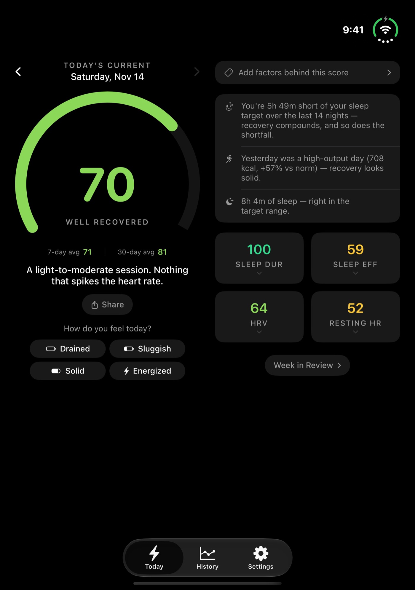
If you have an iPhone Duo, Current now uses the whole inner display.
A bigger screen is an invitation to add things. More charts, more metrics, a dashboard. I didn’t take it. The score works exactly the same. What changed is the arrangement.
Open your Duo and Today splits in two. On the left is the morning answer: your score, your 7- and 30-day averages, the guidance line, and the check-in. On the right is the evidence: the factors you’ve tagged, insights, the four sub-scores, and the breakdowns down to the HRV sparkline. How recovered am I, and why, side by side.
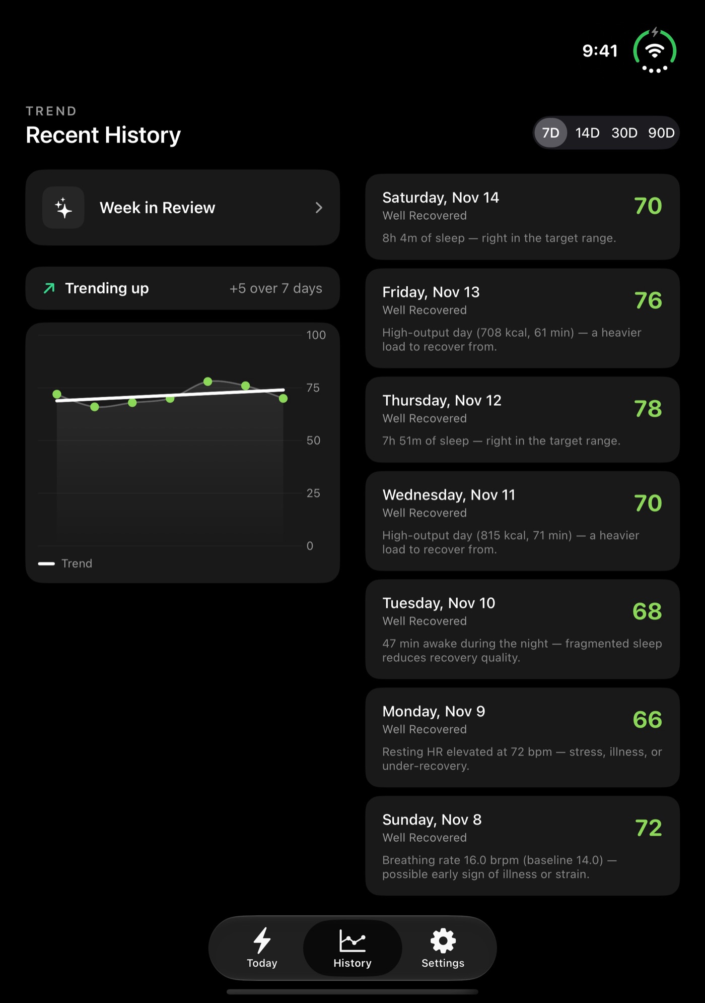
History works the same way. The trend and chart sit on the left, the day-by-day list on the right, so you see the shape of the period and the specific days at once.
Recovery is a morning glance. Open the phone, see the number, close it, get on with the day. On a phone that folds, the app has to survive the fold. Close your Duo and Current moves to the outer screen without losing anything. If you were looking at a past day, that day is still selected. If a sheet was open, it’s still open.
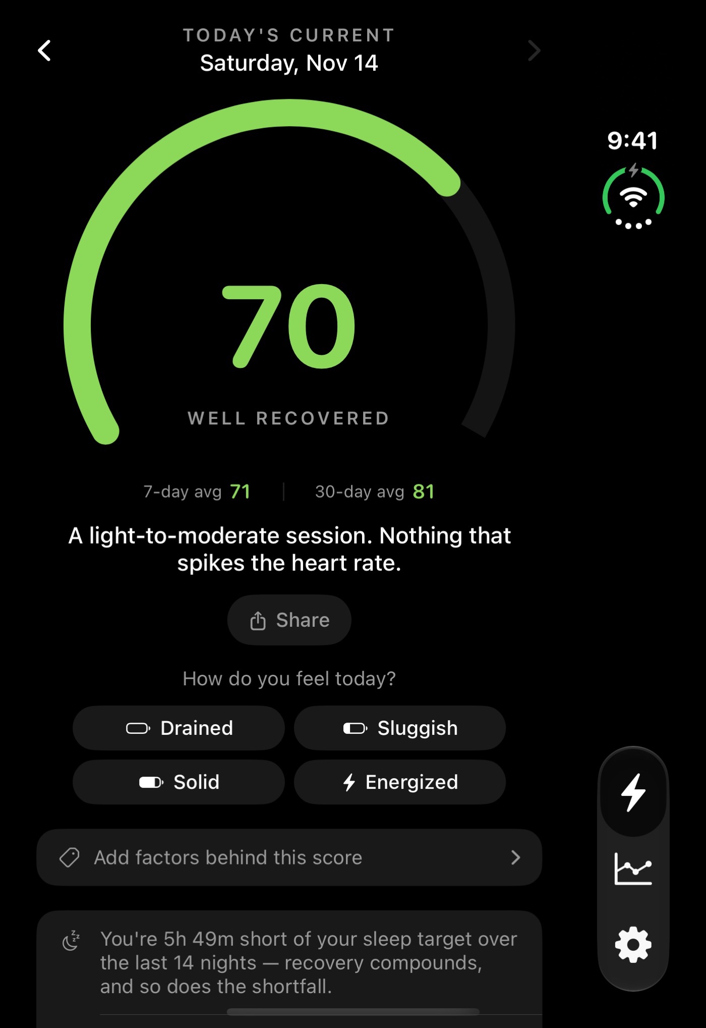
One detail took deliberate work. When you open Current, the score gauge settles into place with a small haptic tap. The obvious way to build this would have replayed that animation and buzz every time the phone opened or closed. Fold it twice and the app would tap you twice to tell you something you already knew. It doesn’t.
Everything else, like Settings, Weekly Mode, and onboarding, sits in a readable centered column on the big screen instead of stretching edge to edge. At the largest accessibility text sizes, the two-column screens fall back to one column so the text never gets squeezed.
And only Duo owners will hear about any of this. 2.3’s What’s New sheet appears the first time Current opens on the Duo’s big screen, and never on a regular iPhone. Telling you about a screen you don’t have would just be noise, and that’s the same rule the check-in follows.
Built for a phone I don’t own
I don’t have an iPhone Duo. Everything here was built and checked in Apple’s iPhone Duo simulator, which lets you fold, open, and rotate a virtual device.
It surfaced one real surprise. Current has always been portrait-only, and a portrait-only app on the open Duo gets squeezed into a column the width of the closed screen, with empty space on either side. Using the big screen meant declaring landscape support, and then taking it away again on every regular iPhone and the closed Duo, so nothing changed for anyone else.
The layout also never asks “is this a Duo?” It asks whether the window is wide. That’s what Apple recommends, and the practical upside is that any future wide-screen iPhone gets the same layout without new code.
It also turned up two small bugs that affected any wide screen. Insight rows had been centering themselves, so their icons stopped lining up, and the Share sheet floated in the middle of the display instead of attaching to the Share button. Both are fixed.
Still one purchase
Current 2.3 is free for everyone who already owns it. No subscription, no account, no ads, and every number in it, including the ones it now knows to leave out, is computed on your own device.
If you’ve been meaning to try it, take a closer look at Current. And if you already open it every morning, the update is waiting in the App Store.
More from Building Current
- Current 2.1: Sleep Gets Serious
- Current 2.0: Your Recovery Score, Now on Your Wrist
- Whoop, Oura, and the Recovery Score I Built for the Apple Watch I Already Owned
- Building Current Recovery Score: My First iOS App
I write about building with AI and the Salesforce platform. Follow along on LinkedIn.
Share on LinkedIn